Wednesday, 20 August 2014

Basing Alchemy with the Bruddhas


I guess by now, most people within the painting community will be aware of the work Michael Bartels is doing with The Painting Buddha project, with the aim of helping us all become better painters. The people involved are all very talented artists and as such there is something for everybody no matter the current painting level you have achieved.

This first part in the Basing Alchemy series focuses on Earth, with almost 50 tutorial chapters across 3 discs, covering subjects such as vegetation and pigments, colour contrast and referencing and sketching, Matt Cexwish and Ben Komets, guide the viewer through building and painting gaming and hidden insert bases and stunning show bases.


So having watched the first two discs before deciding to do a review, all I can say is the standard of Matt's gaming bases are in themselves pretty damn impressive and it was very interesting and informative to see a scenic base built up using the plasticard walls as I have never done that myself.

The production quality is great and the menu system is easy to use with very clear and distinct chapter points, allowing you to watch what you want when you want.

So without giving too much away here are some of my thoughts.

On Disc 3, Ben talks us through the construction and painting of a show base, that is, a scenic base with display or competition in mind. He shows us the importance of identifying and studying details in your references eg the different tones of colour, volumes and vegetation types with emphasis on the theme or atmosphere of the miniature and it's surroundings.

Some very interesting techniques are shown, including his "lazy" way of constructing the sides of his base using a dice box, constructing the volumes of his scenic base with varying thicknesses of cork board. With constant reminders to refer to your references, dry fitting natural elements and carefully choosing what looks right, the base quickly takes shape.

The viewers angle of Ben as he works is great, you don't miss a trick, the dialogue and explanations are regular nuggets of inspiration that make you think "wow, I would never had thought of that!!".

In addition, to the techniques that the Bruddhas teach you, there is another underlying message that they conveyed to me; to be inspired by real life and to have the confidence of experimenting with my colours and base building projects and not to be afraid of making mistakes on the way.

I don't want to talk you through the various techniques, as the guys do it so much better in the DVD, but suffice to say that the series of DVD's they are producing far surpasses anything else that's currently on the market, in my honest opinion.

Join the Bruddha hood and become a better painter today!!


Friday, 1 August 2014

My little review of BrokenToad miniature series brushes.


So, BrokenToad apparently believe it's possible to "have high quality hobby products at affordable prices". Ever since I realised our great hobby was about so much more than citadel paints and Gamesworkshop miniatures, I always followed the mantra of buy the most expensive hobby products you can afford. For the last year or so I have exclusively used Windsor & Newton series 7 brushes and find them far superior to anything I had used before. I usually paint with three different sizes of brush; 0,1 and 2, prices ranging between £12 - 15 a piece. This represents a significant investment. Is it possible for one of the little fish (or toad) to produce and sell brushes on par with the big hitters, considering the price range of these brushes is only £4 - 4.50 per unit? Let's find out!!

The BrokenToad Miniature Series brushes are currently available in four sizes; 2,1,0 and 3/0. They arrived with bristle protectors with each brush in a sealed plastic sleeve along with a nice card overlay with some very useful care instructions for eg i did not know that by keeping the protectors on and storing them point down would prevent one off and paint pigment from gathering within the ferrule. Learn something new every day!  It's been long established that Kolinsky sable hair is the best for artist brushes and these brushes don't disappoint on that front. When I used them this evening, blaring out some punk music and working on my barbarian dude I was surprised at how good they are. The belly of the brush head holds ample paint and the finely tapered point allows for precise and smooth painting. Another important factor is the "snap". This terms refers to the natural reaction of the hair bristles following a brush stroke; for miniature painting it is important that the bristles snap back into their natural position and to a fine point, ready for the next stroke. The "snap" with these brushes is on par with my old trusty 7's.

In addition to the quality of the brushes I am also impressed with their manfacture.

 As an Ecologist, it is a nice surprise to hear that the hair of the brushes is ethically sourced and the varnished Birch wood handles come from sustainable forestry. I took the plunge, expecting in some ways to be disappointed, but I am honestly, pleasantly surprised. 

So to summarise, price is a no brainer being a third of the price of even the cheapest W&N series 7 brushes, the quality is excellent, Eco friendly, great service (ordered yesterday and arrived today) and you will be supporting one of the small guys. They can be purchased here in the UK from Artisan Quarters. BrokenToad get a big thumbs up for me but don't take my word for it, take a chance, you won't be disappointed!!


Sunday, 27 April 2014

A painting challenge

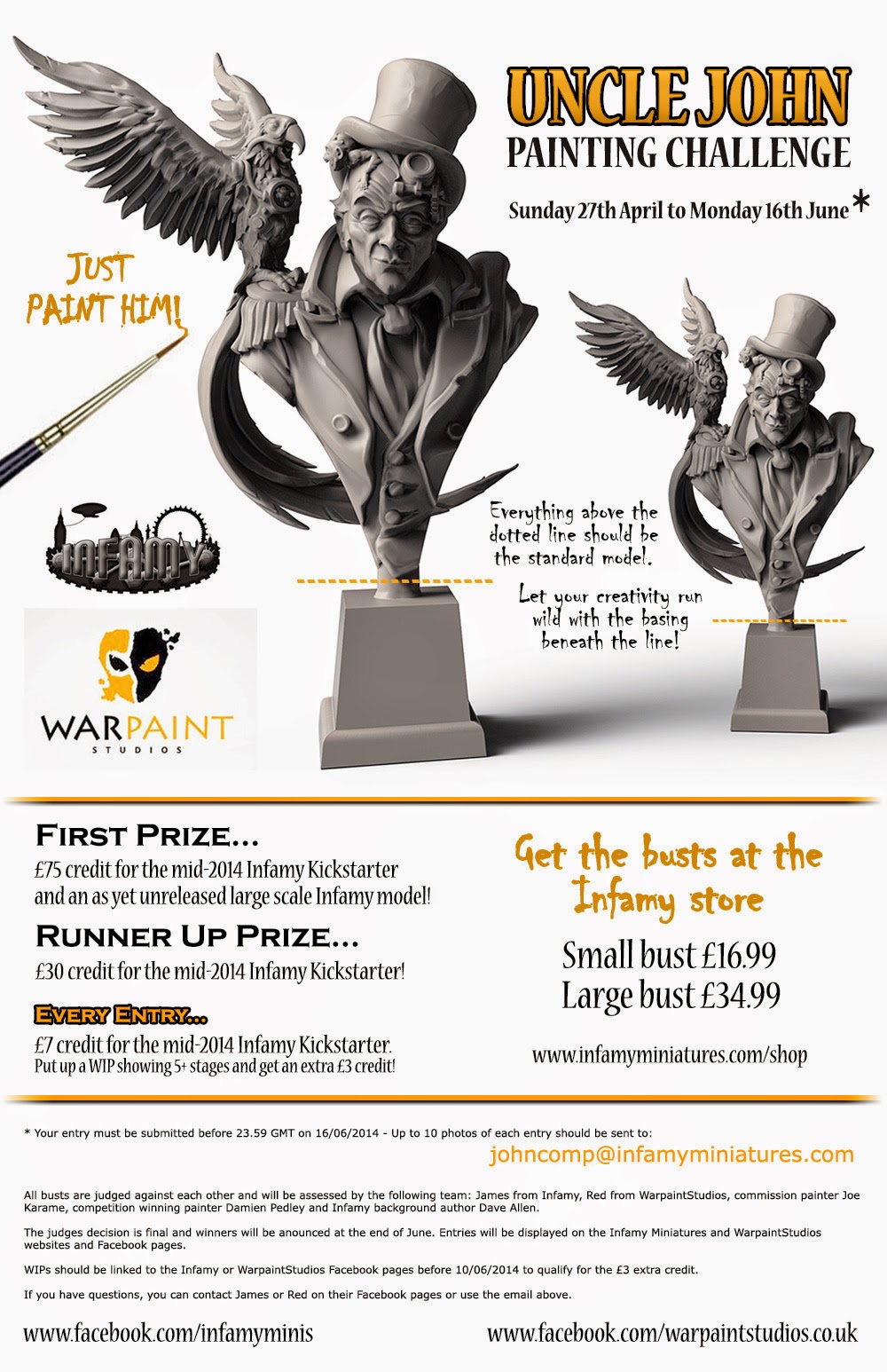
So, after having been friends with James Griffiths of Infamy Miniatures on facebook for a while and meeting him in person at Salute in April 2014, it was quite a surprise when he suggested we join forces for a painting challenge. So rather than letting me blah blah on about this and that, here's a poster explaining everything and links to my fb page and the page for Infamy too.

Warpaintstudios
Infamy Miniatures


Saturday, 8 March 2014

How I painted my Ogre skin!

Over the course of painting an ogre, i had been consistently asked how i painted the skin, so I finally decided to put a step by step together for everybody that may be interested and hope that it may be useful to some people.

Firstly i need to mention my good Polish friend Adam Halon who some of you may know as Loler from the Brush Brothers, who helped me with some techniques and tips during a skype painting session I had with him a few weeks ago.

First of all I applied my base colour which was Cadian Flesh, with a touch of white and a very small tip of black. The black changes the hue of the skin colour a little making it less human like. Previously, I would start applying shades and prior to my highlights and then use the mid tones to smooth transitions and tidy up my highlights. However, I always struggle with contrast and making my highlights bold, so this time i decided to start with the highlights and really push them and make them as bold as possible. In the first photo you can see where i have started applying zentithal lighting by adding vallejo Ivory to the base mix.

I also painted the muscle groups one at a time, constantly thinking about where the light would fall the most, so basically you want most of the light at the very top of the muscle and the least at the very lowest part of the muscle. Don't be fooled into just painting lighter shades immediately along edges of muscles as this will produce a confusing looking mini with no obvious vocal point. Having applied some lights to the first muscle on the upper arm i moved across the shoulders as shown in picture two, which gives you an idea of the contrast achieved with this first highlight.


This first highlight was then worked across all the back and shoulders and along his arms. I broke each section up as I went but that was just a personal preference. More layers of the Ivory paint were added to the mix as I went along, with each additional application of this highlight mix i focused on the upper parts, slowly reducing the amount of highlight as i move closer to the light source.


In some places as I was moving along I decided to start adding some shades and midtones just so as to help me decide where to keep applying the highlights. I found this important, because to get optimum contrast your brightest highlight needs to be applied immediately next to a shade. To further accentuate the contrast on the skin, i introduced warm/cold contrasts. So for instance red was added to the base colour for midtones (warmth) and a solid blue was added to the base for the shades. The very deepest shades had a little touch of black added to the blue and base mix. When applying the midtones and shades, the paint is more heavily diluted than when i apply the highlights. You want to be painting glazes at this stage and build up the colour tones with several applications, if the paint is too thick you will merely be applying a dark colour and covering up your work to date.

In this picture you can see the start of the midtones being applied, down the spine and coming from underneath the muscles and up to the highlighted surface. It is important to move the paint with the direction of your brush strokes, so for midtones, your brush should start near the base colour of the flesh and be worked towards the shades as you would when shading too, the opposite is necessary when applying your highlights.
 
I continue building up the various skin tones as described above and start putting in the shades. At this point it is just about reapplying the same paint mixes and techniques as previously described, always pushing your lights and smoothing the midtones and very carefully working the shades into the deepest recesses. You can then always go back and apply even more highlights by adding gradual amounts of Ivory to the base colour. Along the tops of muscles and along the neck, shoulders and prominent lines of the head i have used diluted pure Ivory.

 I have included this picture to show you the finished levels of contrast but also how the next component of the mini must also work with that which you have just finished. I have lots of cold tones in the flesh of my ogre so went for warm and worn leather for his pants, his boots will be black and his armour and weapons will be cold steel again to compliment his warm leathers. :D

I hope this article may be of use to some people, I use to always ask people what colours they used, but this isn't important, what is however is how the colours you choose interact with each other and create an interesting composition and aesthetic on the miniature. So I now find myself telling people that which I have been told many times, buy a colour wheel and practice, practice and practice.


Saturday, 11 January 2014

Fulgrim on CMON

Ok so the Fulgrim miniature by ForgeWorld that i recently completed is now on CMON. It took about 150 hours to paint, there are so many small elements to this miniature that makes it quite a challenge. I enjoyed and hated painting this in equal amounts but i am quite happy with how it turned out. If you have the time, it would be awesome if you could vote on Fulgrim, heres the link:

http://www.coolminiornot.com/348756

Thanks a lot.
Happy Painting!!

Friday, 20 December 2013

For his honour ......

So my second project is up on Putty and Paint, so please if you want to see the pictures or are members yourselves, maybe you could vote and comment.

Here's the link straight to Fulgrim (Primarch of the Emperors Children)

Cheers guys and Happy Painting!!!

Wednesday, 18 December 2013

Building and painting my first ever Salute entry - Volgor The Skull Hunter.

About 4 years ago i purchased Volgor The Skull Hunter (54mm Warlord Saga) from Andrea miniatures and upon receiving it I have to admit to some trepidation to actually start the project. A house move later and I had lost the loin cloth piece, so he sat in a drawer for about two years. Then about a year or so ago, I bought the mini again from my friend Volomir and today I decided it was time to build it and maybe enter it at Salute 2014. So here's a little write up about the build process and a little review of the miniature itself. Hopefully, time, commitments, commissions an family willing, will finish the article in the future with a piece on the actual painting too.


So as you can see from the picture, you only need pretty basic tools to get the build done. So before we start to clean the various pieces down lets take a look at the contents.


So the miniature consists of a dozen pieces of finely detailed white metal. There is a lot of various textures to the mini that should make the painting very enjoyable. The volumes to the anatomy are very attractive and thus offers painting the skin a host of curves and muscle groups to really go to town on the skintones.

So using my needle file and scalpel, mold lines and flash were removed initially and then the whole of each part was polished up and smoothed with wire wool. This step really does help to provide a great surface to apply the primer and hopefully means that all imperfections have been removed before i start applying paint.

The legs and hands were each pinned. I drilled a hole with a 0.5mm drill bit in my pin vice, into the main body part (roughly central), glued in a length of brass rod and then carefully brought the leg or hand into place. The metal is so soft that by carefully pushing the limb up to the rod, you are able to make an impression to act as a guide to where you need to drill the hole for the limb thus ensuring that the parts meet snuggly and accurately. I repeated the process for each limb.

I decided early on that i would assemble the whole miniature prior to painting and would only leave the shield off and then attach at the end when the painting was finished.

The picture of the shield shows the thin flash that is easily removed with a scalpel. The detail again is excellent.

There were two slight issues during the build but were not too problematic. The feet have pins that sit in the sockets on the rocks of the scenic base. So it was necessary to check during the attachment of the legs that they not only fit nicely into the waist of the mini but that they are also positioned at the necessary angle to allow the foot pegs to sit in the rock sockets and thus get the correct stance. Secondly, Volgor's topknot comes pretty straight and this would look rather strange as the mini is in a dynamic pose ,but if you glue the topknot on it would just stick up in the air. So it needed to be carefully bent back and positioned to look like it is in motion as Volgor swings his immense axe. During this little operation it snapped at the base of the horns that it is attached to. This meant another exercise in pinning but now looks far more natural.

The kit goes together very nicely and now I just hope the paintjob can do this great miniature justice. I will be referring to the article by David Rodriguez in "How to paint fantasy miniatures" by Andrea Press.